Crypto account guides · South Island guide
Accessible crypto casino lobbies: currency labels, keyboard controls and mobile readability
 Best casinos available in New ZealandUpdated 7 November 2026

This guide shows how to assess whether a crypto-casino lobby communicates amounts and controls clearly across keyboard, assistive technology and phone use. It separates a coin amount from a fiat estimate, gives observable checks for focus, labels, contrast, zoom, dialogs and motion, and explains how to record limitations without claiming a formal accessibility audit.
The short answer
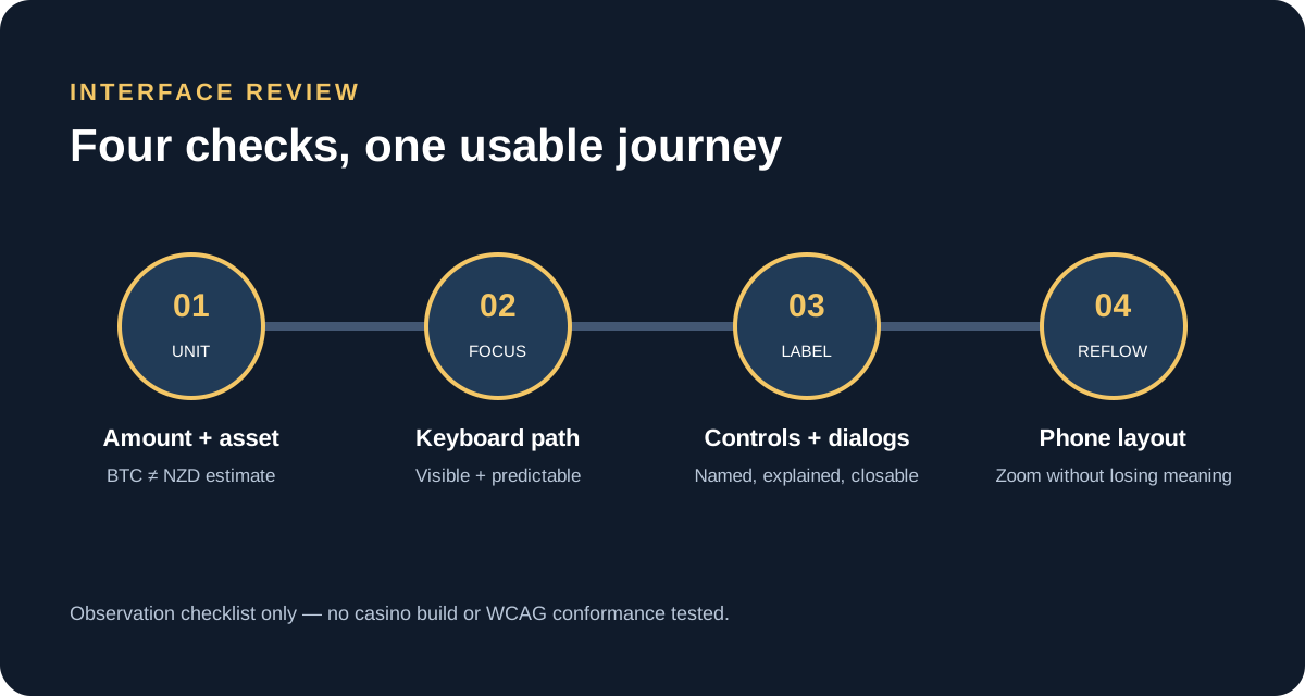
To assess an accessible crypto-casino lobby, look for three things at once: an amount must have an unambiguous unit, an action must be perceivable and operable, and the same information must remain usable at the reader’s chosen screen size and input method. “0.015” alone is not a clear balance. A button that looks obvious but has no accessible name is not necessarily understandable to a screen reader. A lobby that works with a mouse at desktop width has not thereby been checked on a phone or with a keyboard.
This page offers a repeatable observation checklist for a person considering an interface. It does not report a test of any named casino. It does not award an accessibility score or claim that any site conforms to the Web Content Accessibility Guidelines. The W3C describes WCAG as a technical standard with testable criteria grouped under four principles: perceivable, operable, understandable and robust. A complete conformance claim requires evaluating the applicable success criteria, the full scope of the product and relevant states. A short reader checklist cannot substitute for that work.
Use the checks below to identify friction and to ask specific questions of support. Stop before making a deposit if you cannot tell which asset a number represents, cannot reliably reach the controls, or cannot understand what an action will do. The objective is comprehension and control, not finding a way to continue playing.
What this assessment covers
“Lobby” can mean the account header, wallet panel, cashier, game catalogue, search results, game launch screen and overlays shown on the way to a game. Each is a different interface state. A balance may be available in one asset while the lobby is filtered to another. A game may open in a separate frame with its own keyboard behaviour. A mobile menu may expose controls that were not visible at desktop width. Accessibility therefore needs to be considered across the journey rather than judged from a landing screen.
This guide is about observable design and content: readable text, meaningful labels, focus movement, keyboard operation, understandable dialogs, motion settings, responsive layout and currency presentation. It does not cover private-key recovery, blockchain wallet security, game strategy, account identity checks, payment advice, licensing or a particular operator’s responsible-gambling controls. When an operator-specific setting is not visible, record it as unknown rather than assuming that it exists.
A useful review separates observation from conclusion. “The close icon has no visible text when focus lands on it” is an observation. “This product fails WCAG” is a standards conclusion requiring a defined evaluation. “The site is accessible” is broader still and should not be inferred from a handful of checks. Record the page, state, device, input method and time so another reviewer can reproduce the observation.
Start with the amount: currency, asset and estimate labels
Numbers become misleading when their units are hidden. A wallet display could show 0.015 BTC, a stablecoin amount, NZD held in the account, or a converted NZD estimate beside a crypto balance. Those are not interchangeable descriptions. Look for a currency or token code immediately beside every actionable amount, not only in a tooltip, settings menu or colour legend. Check whether the same label remains visible in the lobby, cashier, bet controls and confirmation screen.
The interface should distinguish the stored unit from an estimate. For example, if a screen shows a crypto amount and an approximate New Zealand dollar equivalent, the two values should be labelled separately and the estimate should be recognisable as approximate. The estimate might update as a market price changes; the number of tokens in the account might not. A coin icon alone is not a reliable unit label because icons can be unfamiliar, visually similar or unavailable to assistive technology.
Inspect decimal places and rounding. If the lobby rounds a small balance to “0.00 NZD” while the account ledger still contains an asset amount, a person may mistake rounding for a zero balance. If a display omits trailing zeroes, ask whether “1”, “1.0” and “1.00” are being presented in the same denomination. The visible number should not suggest more precision than the underlying conversion or display supports. Where an exchange rate or timestamp is shown, determine whether the page explains when it was refreshed; do not infer real-time pricing from a changing animation.
Check every place where the amount acquires a new meaning. A game launch can display a stake in a denomination different from the account header. A cashier can list “available”, “pending”, “locked” or promotional funds separately. These labels should be clear in text, and a person should be able to identify which balance a wager would use before confirming. A colour change, badge or tiny tooltip is not enough if it is the only distinction.
On a phone, test whether the code remains attached to the amount after wrapping or horizontal scrolling. A line break between “0.015” and “BTC” can make the unit appear to belong to the next row. A narrow sticky header may truncate “NZD estimate” to “NZ…” or hide it behind a menu. Reduce viewport width and enlarge text to see whether the amount, unit and status stay together. If the product allows a user to choose display currency, check that the active choice is announced and is not confused with the actual account asset.
Contrast, size, colour and zoom
Colour can reinforce a distinction, but it should not carry that distinction alone. Deposit, withdrawal, bonus and locked-balance rows may use different colours; each should also have a visible text label or another shape or pattern. Errors should be described in words, and a success state should not be communicated solely through green. Inspect muted text, placeholder text, disabled controls and text displayed over game artwork, since these often have weaker contrast than the main page copy.
Contrast has to be considered for normal text, large text, controls, borders and focus indicators under the criterion that applies. A page can look readable on one display and become difficult under glare, low brightness or a custom colour scheme. The W3C’s WCAG resources list the actual criteria and explain how they are tested. This article is an observation guide, not a measurement of contrast ratios. If a formal result is needed, use a documented testing method and record the exact colours and states examined.
Try browser zoom and text enlargement without changing the browser’s layout through developer tools. At 200% zoom, can you still locate the account menu, currency selector, game-search field, rules/help control and close buttons? Does a page force a two-direction scroll for ordinary text and controls? Are labels clipped under a sticky header? A visually enlarged screenshot is not evidence that all content is accessible, but a clear failure to reflow is a practical warning that needs investigation.
Text should remain readable against background images and changing game tiles. Promotional artwork may contain words embedded as an image; if so, those words may not scale with page text and may have no accessible text equivalent. Check whether essential instructions, currency labels and warnings are actual text in the interface. Decorative background imagery should not compete with controls, and a user should not have to decipher a stylised font to understand a balance or error.
Keyboard access and visible focus
Set the mouse aside and move through the interface with Tab, Shift+Tab, Enter, Space and the arrow keys where appropriate. The focus order should follow a sensible reading and interaction order: account navigation, search and filters, game cards, footer or help controls, depending on the page. It should not jump unpredictably between a hidden menu, the page behind it and an overlay. A skipped focus stop may make a control unreachable even though it is visible.
Watch the focus indicator. The current control should have a visible outline or another clear highlight that remains visible against adjacent colours. If focus disappears on a dark card, moves behind a sticky banner, or is visible only as a subtle colour shift, a keyboard user may lose their place. Test the focus state in the game catalogue, account dropdown, currency picker, cashier, help panel and modal—not only on ordinary text links.
Use Enter or Space to activate controls according to their role. A link should navigate; a button should perform an action. A custom clickable card should not require a mouse click if it visually looks interactive. A drop-down menu should open, expose options, let the user choose one, and close without forcing a pointer. A slider or spinbox requires a defined keyboard interaction; do not assume that a drag-only control is operable.
Inside a modal, focus should move into the dialog when it opens, remain within the active dialog when that is the expected pattern, and return to the triggering control when it closes. Pressing Escape should close dismissible overlays where appropriate; if the action is intentionally blocking, the reason should be explained and a keyboard-accessible way forward provided. Test both the close icon and any visible “Cancel” button. An icon without a text alternative can be difficult to identify, and a tiny target can be difficult to activate even when it technically receives focus.
Check for keyboard traps: a user can enter a region but cannot reach the rest of the page or exit the region. Embedded game frames are a common boundary to assess separately. A frame may use different controls or capture keys. If the only way out requires a mouse, browser reload or closing the whole tab, record that as a serious usability issue. Do not enter personal or payment information just to test a focus path.
Screen-reader names and page structure
Turn on a screen reader only if you know how to use it safely, or ask a qualified tester. As you move through account and game controls, listen for each control’s name, role, current value and state. “Button” without a meaningful name does not explain what a control will do. “Image 7239” does not identify a balance. A balance label should be announced with the unit and any important state, such as pending or unavailable, rather than just the numeric string.
Headings should describe the sections they introduce and form a usable outline. A screen-reader user may navigate by headings instead of reading every item. Repeated cards need names that distinguish their games or actions; a row of identically announced “Play” buttons does not identify the destination. If a coin logo is decorative, it need not repeat adjacent text. If the icon conveys an asset or status not written elsewhere, it needs an accessible text equivalent.
Form controls need programmatic labels that remain available after placeholder text disappears. Search, password, email and amount fields should have instructions that explain accepted input and validation. Error messages should identify the affected field and the correction required. A toast that vanishes immediately can be missed by a screen reader; a user should be able to find transaction or selection status without relying on a fleeting animation.
Tables used for account history should expose column headings and row relationships. On narrow screens, a horizontally scrolling table can preserve data but may be difficult to navigate. If rows become stacked cards, each value still needs its label. A transaction entry showing “0.01” should not separate the unit, date, status and transaction type into unrelated announcements. Users who use magnification, keyboard or a screen reader should be able to connect each value to the correct transaction.
Dialogs, help panels and controls that hide content
Account lobbies often place terms, cashier flows, game rules and session notices in overlays. Confirm that the overlay has a clear heading, that its purpose is understandable before a user confirms, and that the dismiss action can be reached by keyboard and touch. If the dialog is larger than the screen, the content should scroll inside a predictable region without hiding its final action. The page beneath should not receive accidental input while a modal is active.
A help panel should give the rules in readable text, not only as tiny image labels or a video with no captions. If a paytable is a graphic, check whether the key information is also available as text. A close icon should have an accessible name that refers to the panel being closed. A focus return to the help button makes it easier to resume the previous task. If opening help resets a game or changes a setting, the interface should state that effect before the user acts.
Before submitting a consequential action, look for a review step that repeats the important details in plain text: amount, unit, selected action and relevant account state. A control such as “Continue” is not informative if the preceding screen has several possible meanings. Confirmation should not depend on colour, sound or a timer alone. If an action cannot be reversed, the user should be able to understand that before activation.
Motion, sound and time-based messages
Animation can signal a new state, but it should not be the only way to receive information. A coin count that appears only through a fast-moving visual effect may be difficult to follow. Check whether the final amount is also presented in a stable text field or account record. Sound cues should not substitute for visible status. If audio can start automatically, check whether the interface offers a clear control to mute or stop it.
Look for a way to reduce non-essential movement when the device or browser requests reduced motion. A short animated transition can still create difficulty for some users, especially when repeated or flashing. Avoid treating a “quick” mode as an accessibility option unless the interface actually exposes an appropriate preference and explains its effect. Fast mode may speed up events without making them easier to perceive.
Reality checks, countdowns, session reminders and temporary messages create time pressure. A notification should be readable before it disappears, and it should not repeatedly interrupt keyboard focus. If an interface gives a timed decision, find out whether the timer can be extended or the choice can be made without racing. Do not assume a displayed reality-check timer is a spending limit or a substitute for a dedicated, enforceable account control. This guide does not verify any operator’s safety features.
Phone layout and touch interaction
Use a real phone or a responsive browser viewport and test in portrait and landscape if the product claims both. A screenshot at desktop width scaled down to fit a phone is not a mobile review. Text should reflow, account labels should stay attached to the values, and controls should not overlap game cards or the browser’s own system controls. Check both a short screen and a tall screen because a dialog can fit one and be clipped on the other.
Touch targets need enough area and spacing that a person can select the intended control without activating a neighbouring action. A narrow close icon next to a spin or cash-out control deserves special attention. Orientation changes, browser text enlargement and on-screen keyboards can reduce the remaining viewport. Check that form fields, submit buttons and error messages stay visible when the keyboard is open.
Do not infer accessibility from the fact that a site is responsive. Responsive layout describes adaptation to viewport dimensions; it does not automatically establish accessible labels, meaningful focus order or assistive-technology support. A game canvas can fit the screen while its controls remain unlabelled. A mobile menu can work by tapping yet be inaccessible with an external keyboard or screen reader.
A practical observation record
For each issue, capture enough context for another person to reproduce it, but do not include passwords, wallet secrets, identity documents or unnecessary personal data. A concise record might include the page path, date and local time, device/browser, viewport, input method, zoom, selected interface language, and the sequence of actions before the issue appeared. Use a screenshot only when it clarifies a visual defect; redact account identifiers and balances where possible.
Describe the expected behaviour and observed behaviour separately. For example: “Expected: choosing NZD keeps the selected unit beside each amount. Observed: the cashier modal shows a bare number after the page is zoomed to 200%.” Avoid adding a WCAG criterion number unless you have mapped the observation to the current criterion and tested its conditions. The W3C’s documentation distinguishes guidelines from the testable success criteria and supporting techniques.
Prioritise barriers by whether they stop someone from understanding an amount, reaching a control, completing an ordinary task or recovering from an error. A decorative alignment issue may be lower priority than a confirmation button that cannot receive keyboard focus. Record when the issue occurs, whether it is consistent and whether an accessible alternative is visible. Do not claim an issue is fixed until the same state is retested.
If you contact support, ask focused questions: which unit is stored, whether the NZD figure is indicative, how keyboard or screen-reader users can reach a stated action, and whether a listed control is available in the current account version. Avoid sending sensitive data through an unverified channel. If an answer depends on an operator-specific integration, request the exact title, version or screen rather than relying on a generic marketing statement.
Checklist before relying on a lobby
Use this short sequence before interacting with an unfamiliar interface:
- Read the amount and adjacent unit. Separate token balance, fiat-account balance and approximate NZD estimate.
- Confirm whether the amount is available, pending, reserved, promotional or otherwise restricted.
- Enlarge the page and test whether labels, search, account navigation and help remain visible.
- Move through the interface with a keyboard and confirm the current focus is easy to see.
- Open and close a help panel or modal; check focus entry, dismissal and return.
- Listen to control names and transaction labels with assistive technology if available.
- Check the phone view for wrapping, small targets, obscured labels and keyboard-triggered clipping.
- Look for text alternatives to colour, animation, audio or icon-only instructions.
- Record uncertainties and ask support a narrow, evidence-based question.
- Stop if the unit, action or account status cannot be understood before a consequential action.
This sequence is not a formal accessibility evaluation. It is a way to turn a vague impression into reproducible questions and to avoid proceeding when important information is unclear.
What a responsible conclusion can say
A careful conclusion names its scope. It might say that the reviewer checked one desktop page and one mobile account screen using keyboard input, observed that two controls lacked visible focus, and did not test a screen reader or every game frame. It should not say that the entire casino is accessible, inaccessible, compliant or non-compliant unless the evidence and evaluation scope justify that statement.
The WCAG overview maintained by W3C describes version 2.2 and its principles, guidelines and conformance levels. Standards change and implementation guidance is updated; consult the current W3C material if you are conducting a formal audit. This guide was prepared from the W3C overview reviewed on 8 October 2026 and is not itself a WCAG audit. The relevant test should be selected for the specific content and interaction under review.
For a New Zealand reader, the practical outcome is to keep the decision with the person using the site: do not treat a visually polished lobby as evidence that balances and controls are clear. Confirm units, read what a control changes, and use an alternative support channel if the interface cannot be operated or understood. A site’s ability to accept a cursor click does not answer whether its information and actions are perceivable and operable through other means.
Sources and verification boundary
- W3C Web Accessibility Initiative, WCAG 2 Overview, reviewed 8 October 2026. It describes WCAG’s four principles, testable success criteria and levels; no casino product was assessed against the standard.
- New Zealand Department of Internal Affairs, Online gambling for advertisers, reviewed 8 October 2026. Affiliate CPA links are withheld pending the current NZ advertising restrictions; this is a publishing hold, not legal advice.
- No named casino lobby, operator game, mobile build, screen reader, keyboard implementation or colour contrast was tested. No conformance claim is made.